
The humble style sheet is an important tool for every copyeditor. It’s a record of facts, decisions, and miscellany for an editing project. More than a record, though, it’s a key reference for you and others involved in the publishing process to create consistency and quality in a manuscript.
Yet it’s not meant to be comprehensive, says Bonnie Trenga Mills in a 2013 Grammar Girl podcast. It should include “only absolutely vital items.” She notes that according to The Handbook for Proofreading, “the right kind of style sheet is intended to save time and trouble.”
What you put into your style sheet and how you organize and format it, then, are key to the document fulfilling its purpose, for you and others.
What makes a good style sheet? While, like editing itself, there’s no one right way to do it, following these four principles will create a usable style sheet.
Principle 1. Include Only Necessary Information
Students and new editors tend to enter every hyphenated compound and detail every style rule applied in their style sheets. It’s tough to be discriminating when you’re still learning what’s important, yet it’s worth the time to learn. Not only does creating an overfull style sheet take a lot of time, it also results in a document that’s hard to navigate.
Instead, enter only necessary information. That will vary by project and publisher, but in general you want to record the following:
- Resources. List the project dictionary, style guide (in-house and published), and any other frequently used resources.
- Alternative style rules. For example, if you decide to use an alternative rule for spelling out numbers instead of the one in your chosen style manual, list the rule on the style sheet.
- Exceptions. If you make an exception to one of the style rules you’re following, such as not spelling out a specific abbreviation, enter that on your style sheet.
- Proper nouns you’ve fact-checked.
- Special words. These are words that don’t appear in the dictionary or another stated resource (e.g., an industry-term glossary) or that are spelled in an alternative way.
- Abbreviations and their spelled-out forms. This is especially helpful for longer projects where you might forget which abbreviations have been introduced already. Note the abbreviations that don’t need to be spelled out, too; this will tell readers you’ve addressed it.
- Rules you want to highlight for quick reference. For example, I usually note whether spaces are used before and after dashes and ellipses because I can never remember which client follows which style. It’s easier to have a brief entry in my style sheet than to look it up every time.
Think about what’s unique to your project and what information would be difficult or impossible to dig out from either the project itself or a resource. Add that to your style sheet. For example:
- Lists of tables and figures
- Bibliography format
- Lists of characters, places, and events (fiction)
- Permissions
- Notes on writing style
A good rule of thumb is to list a rule instead of all instances of it, and to list one resource instead of all the rules you’ve applied. Put another way: Don’t list a term if you can list a rule instead, and don’t list a rule if you can list a resource instead.
Principle 2. Organize Entries Logically
Even if you stick to necessary information only, a style sheet can run on for pages, especially for long books. Since the style sheet’s main purpose is to be used, structuring it in a way that lets you and others find information quickly and easily is crucial. The more types of information you have, the more you need to think about how to organize them.
A style sheet that’s one or two pages long could simply organize entries alphabetically, as in a dictionary. A 20-plus-page style sheet would benefit from organizing information by category, such as with sections of special words, abbreviations, tables, and figures, as well as notes and permissions.
Organize within categories in a way that makes sense. For example, words and abbreviations can be alphabetized, tables and figures can be put in numerical order, and notes and permissions can be put in by page number.
Sometimes you’ll realize partway through a project—or after several projects for one publisher—that you need a different organizing scheme. Style sheets are living documents; update and reorganize them as needed for better usability.
Principle 3. Use Minimal, Functional Formatting
We editors spend so much time with our style sheets that we become attached to them. They are works of beauty in our eyes, with all our decisions and data organized to perfection. We want others to see its beauty as we do. We want clients to be reminded of our business’s brand when they use the style sheet. We end up formatting the style sheet to within an inch of its life.
It takes a lot of time to maintain a complex format. Do you really have the time for that? And if you’re a freelancer, how much of that time should you be charging to the client?
Complicated formatting can also inhibit usability. Do the six different colors or the font change signify anything? Formatting should be informational rather than decorative. Readers should be able to glance at your style sheet and quickly determine what the formatting features mean.
Choose fonts, colors, and point sizes that are easy on the eyes. I’ve asked students to avoid using fonts like French Script and Lucida Calligraphy because they strain my eyes, even at high magnification. Don’t drive readers’ eyes away!
That said, if you’re a freelancer, include your logo, website, and contact information in the style sheet. Make email addresses and URLs clickable so readers can contact you easily. Just be sure your branding elements don’t take over the page. They should be secondary to the usability of the style sheet.
Principle 4. Meet Users’ Needs
A style sheet has to meet your needs and those of other users, such as the author and proofreader.
Some publishers dictate how the style sheet should be organized and what should be on it. I’ve heard horror stories of clients who wanted the smallest minutiae added to the style sheet. All an editor can do in such a case is comply.
But that doesn’t mean you have to sacrifice a usable style sheet. Once you have a template that works for you, use it. Then take time at the end of the project to create a second version that meets the publisher’s mandate. You’ll make up for that time with all the work you’ve saved by editing with a functional style sheet
Now that you know what goes into a style sheet and how to organize it, let’s look at how to lay out the information.
Dictionary Layout
Most of my projects are less than 20,000 words each, resulting in short style sheets. For those projects, I use a dictionary, or alphabetical, layout.
Many of my clients send me multiple short projects a month. For them, I use the same layout, updating the style sheet on a rolling basis. I limit words and abbreviations to those that occur frequently across projects to keep the style sheet manageable. However, I add standard language, such as the copyright line or a mission statement, so I can ensure it’s the same each time.
Here’s an example of a style sheet’s dictionary layout (click to embiggen):
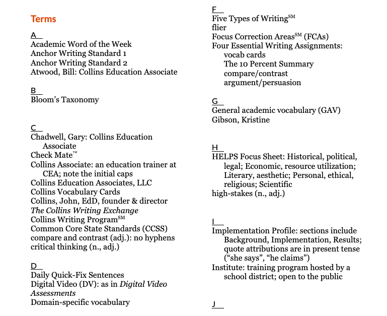
The template I created (download the template) has some basic info at the top. Section headers are bolded, examples are italicized, entry heads for style rules are bold italics, and new entries are highlighted. That’s really the extent of my formatting. I also include the date in the file name so I know how long it’s been since the file was updated.
Grid Layout
Another template lays out the alphabetical sections in a grid; some include sections for abbreviations, bibliography, common style rules you’ll apply (e.g., capitalization), and design notes. This can be a good layout for scanning the alphabetical sections and jumping to additional sections quickly. Many of my editing students prefer this template layout. Check out a sample of the grid layout below (click to embiggen):
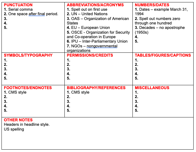
Personally, I don’t like the boxes, as they’re small and a style sheet with many entries will look overwhelming in a grid layout. But do what works for you.
Column Layout
Katharine O’Moore-Klopf shares examples of her academic, medical, and fiction style sheets on her website. After a header that includes basic project information, the style sheet runs in a two-column format with several sections, including sources, list of figures, style rules, and words.
“Their organization makes it easier to me to find the style points that I want,” says O’Moore-Klopf. “Each section is in alphabetical order to make searching easy. Entries also contain summaries or notes about plot and overall themes in the project.”
Multiple Style Sheets
Amy Schneider keeps four style sheets for fiction projects: general style, characters, geography and buildings, and a timeline. The demands of fiction—keeping a fictional world, even one based on reality, knit together—mean tracking a lot of facts: physical descriptions, ages and birthdays, descriptions of interiors and exteriors, the passage of time, and so on. That makes the style sheets necessarily more complicated.
Schneider chooses to categorize that information into four files; you could easily put them in one file, organized in major sections. You can read more about Schneider’s approach to fiction editing in her book, The Chicago Guide to Copyediting Fiction.
Don’t Start from Scratch Every Time
If you don’t have a style sheet template, you really should create one. It will save you time with each project you start and ensure you don’t forget important details.
But you don’t have to start from scratch. Download one of the templates from this post to give yourself a head start.
Important tools don’t have to be large, complex tools. Their value is sometimes best realized in being small and simple. Keep your style sheets short and sweet, and they’ll do right by you.
A version of this article originally published in the June–July 2018 edition of Copyediting newsletter.
2 thoughts on “Crafting Usable Style Sheets”